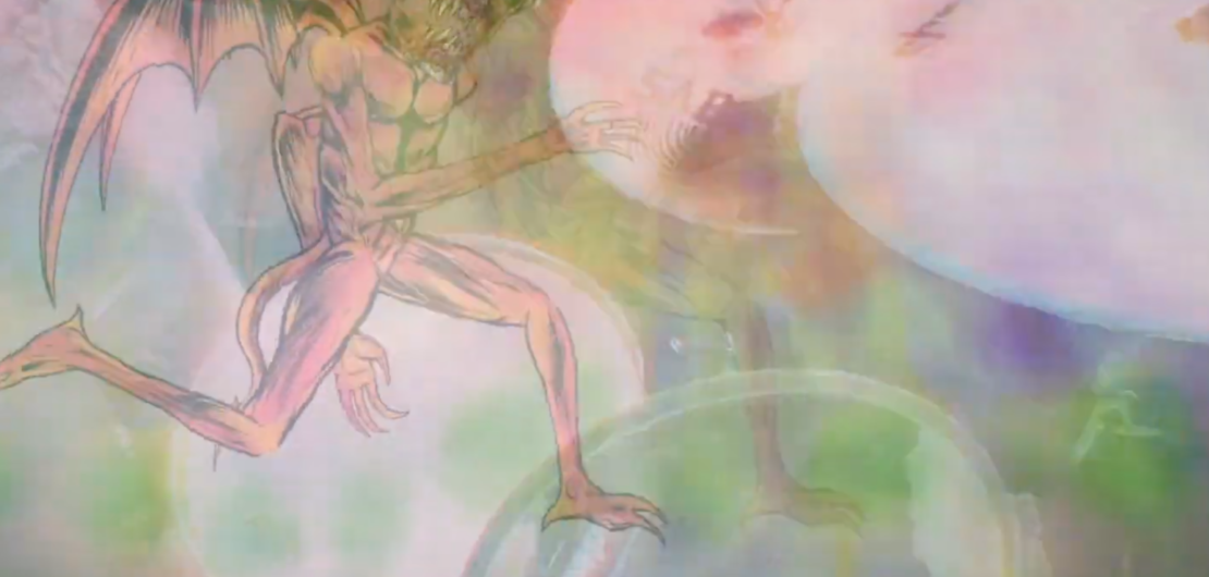
 Motion Graphics
Motion Graphics
Motion Graphics
Motion Graphics
Motion Graphics
The Pedal of Doom is a unique boutique distortion/fuzz pedal is sure to give you the extra sonic buzz you’re looking for. All the proceeds from this pedal’s sales go to helping fund the animated fantasy film, the Planet of Doom, getting finished! Get in on this preorder pedal or forever long for the distorted plateaus of shredder hell that you’ll miss! Pedal of Doom made by ITS ELECTRIC!
Pedal company Produced by / Script / Direction / Acting: Skinner
Animation: Mark Reategui
Produced by / Script / Direction / Acting: Skinner
Acting: Garzo Garcia
Video Editing: Mark Reategui
 Motion Graphics
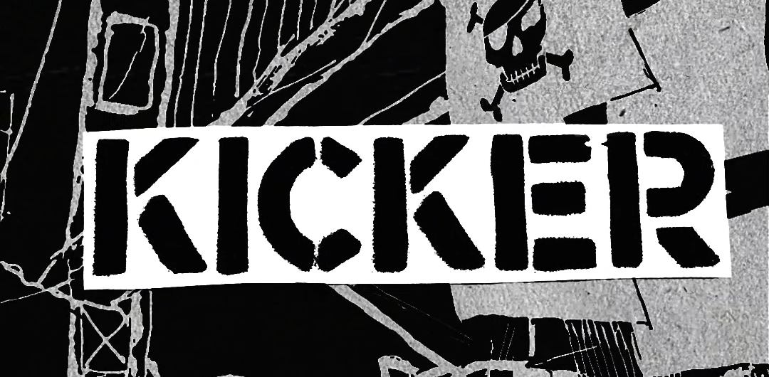
This is and Instagram promo video for the Pirates Press ‘Rock the Ship’ after-party at Eli’s Mile High Club, Saturday, October 19, 9:30pm with KICKER, Roadside Bombs, The Vicius Cycles and a secret special guest.
Original flyer backdrop illustration by Tim Armstrong, song is ‘Wankers on The Bus’ by Kicker. I used the art as backdrop and animated it in After Effects, the text I cut out by hand from the flier and did stop motion with greenscreen, did the voiceover too.
 Motion Graphics
When I was in Peru a few months ago I ran into some friends who live in Denver and they have a band called Egoista and they were telling me that they need a logo and already have an idea for it. They wanted it to a rip of the written out Bowie ‘lightning bolt logo’.

I looked at some variations of the original logo, this is the sample I started out with. Next step was making a sketch:
I brought this into illustrator and started picking out some fonts and tracing over the rough sketch. I went with Kabel Ultra.

The process was pretty straight-forward as far as logos go.
This was the final result, they are happy with it!
Video editing project for Cliterati via Tankcrimes. I made a custom mogrt for stop motion looking typewriter text.
 calligraphy
A personal project, Huaycal Engineering is a featherbrained humor youtube project I made with some friends. Huaycal Engineer Vol. 1 was the song for it, this is the album cover graphic; something quick & fun using India ink and calligraphy pens.

 Ads
Ads

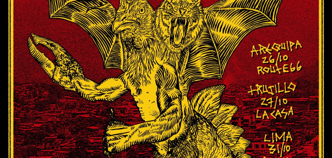
Metamorphosis asked me to do a tour graphic for a t-shirt. They asked for it to be a graphic that could be screen printed in two color.
I had talked with them a little bit about the graphic ideas. Possibly a tiger chicken bat idea, but they asked for a crab hand in there too. Here’s my process:

I started out with this collage as a sort of sketch for the graphic.

The next step was to print it out in cyan (or any color that could later be removed) to go over it with india ink.

This was my initial ink, when I saw it the next day I wasn’t that happy with it but I went with it anyways.

This was the first rendition of the tour graphic. I submitted it to the band as a preview but I told them it was okay but could be better. I thought of using some Peruvian landscape in the background printed as halftone dots, this one was too muddy as well. The band wanted me to use the logo I had previously drawn for them too, and hand-done text. We also talked about a different color scheme.
The next step was to print it out in two sheets to get higher detail.


This is where the tour graphic initially went, I drew the text by hand, I think this was what the band asked for. The final rendition was simplified a little bit from this, without the reflected text and the additional lines on the top part.
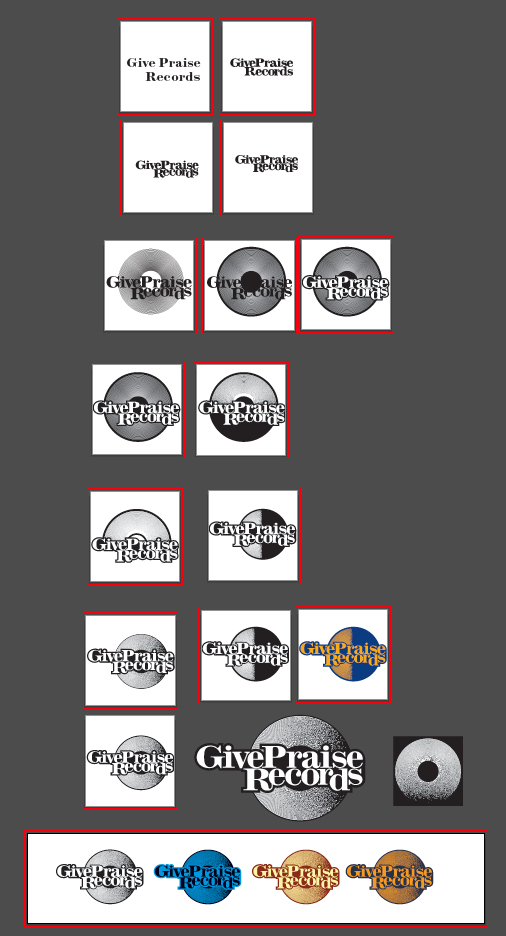
Logo design for Give Praise Records:
![]()
![]()
![]()